 Oddbean new post about login | logout
 A #Nostr logo is urgently needed. We need a recognised and recognisable identity. Fragmentation is not attractive. Linux teaches... cc @fiatjaf @jack @Derek Ross @ODELL
@𝕾𝖊𝖗 𝕾𝖑𝖊𝖊𝖕𝖞
https://i.nostr.build/5GL4z.jpg
just kidding I’ll see what I can do tomorrow 🤣 no promises I’m not really a designer, just a memer that likes to try new stuff!
 First thing that comes to mind
https://m.primal.net/IqCh.jpg
Take your pick https://nostrdesign.org/docs/resources/
 https://nostrdesign.org/assets/images/nostr-icons-79ad5c8dcc671eba7b5d8b16316e1abe.png
So these are the official logos?
Nothing on nostr is official
We need something official, like the orange bitcoin logo
I understand the argument, but thinking at the protocol level, I can't say I would recognize an official HTTP, FTP, SMTP, IMAP, POP3 logo if one were to exist. We need platforms on this protocol to make names for themselves.
 I agree with Derekstr Rosstr
People shouldn’t even need to know if something is built on nostr because the app’s brand is more powerful
We need only the acronyms to be 'official': BTC/LN/NOSTR
HTC/LN/NOSTR looks much like GNU/Linux…
The problem with app brands are that they don't promote interoperability. Like many people didn't know that Google Talk used to be a Jabber server.
Us tech nerds did. The non tech nerds didn't need to know that.
Even non-nerds usually know that they can email someone at Hotmail from GMail and vice versa, and it's great. I'd like it to be the same for Nostr.
So we will remain fragmented and unrecognisable, OK.
 If you can convince everyone to use the same nostr logo, go for it.

I ran an informal poll a while back and there was no consensus whatsoever.
There is an official bird, though.
There has only been one official logo and that’s from fiatjaf. And it’s not a bird.
I say official lightly 😆
The most important debate to be settled is whether it’s: NOSTR, Nostr or nostr.
 The only issue I see, is when people want to use a logo on their website and this fragmentation will dilute awareness. But eventually it won't matter. Just like no one uses the same logo for advertising their website on printed media. People just recognize it.

phone: 123456789
web: my.house
email: me@my.house
nostr: me@my.house
 I see your point, but do you agree with me that fragmentation is good for variety but detrimental to entry understanding for new users?
Kind of like when you have to choose a Linux distribution, it's good to have so much choice, but not all linux OSes are the same and it's a hindrance for those who don't know where to start.
Nostr is a protocol, but people who are not already here don't understand that difference, most people who hear about Nostr, they look for Nostr, they don't look for Nostrudel, Snort, Primal etc etc and when they see that they are so different from each other they get stuck.
 I''d argue that there is need for a visual identity for the network, not for the protocol. the #nostr network is the collective of apps, relays, clients and users.

when sharing and identifying things online, it helps to understand that users are sharing from/to "nostr, the network"
I agree with this. One could say the same for any technology/service using #Bitcoin too. The brand being marketed to potential users is the service/tech that utilizes the base layer. Marketing the base layer alone could confuse people not in the “trenches” so to speak.
You are wrong, though, all these protocols have an official logo, here is it: https://www.google.com/images/branding/googlelogo/1x/googlelogo_color_272x92dp.png
😂 Sad and true.
 Ser, can nostr haz logo ?

https://media1.tenor.com/m/0rPjitCLTt8AAAAC/cute-kitten.gif
I used this company's search machine sir, to search for nostr and their store to install the app. Thanks god they allowed me
should have used https://kagi.com/
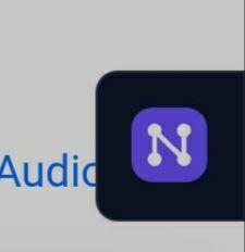
This doesn't include the one nostr band uses :)
 https://image.nostr.build/76ff725c44b9aa17d7937ff54918c851bb1150afea17f96a52840eb4dad2a5e0.jpg

I remember this conversation ages ago.

Maybe under the hashtag #nostrlogo or something.

The ostrich silhouette one seems most used, but yeah nothing is 'official' but it does seem to have won. I think I like that one the least, maybe lol
 I also found this
https://github.com/satscoffee/nostr_icons
No, it's not the official logo, sorry
Maybe we also need to have a single app and a single relay and a single registry of pubkeys associated with names and a single place that stores an encrypted private key that can be recovered with that name and a password, with email recovery in case people forget, everything would be so much easier, the sun would shine, birds would sing and the sky would be blue.
Is this satire? Yes the logo is needed but everything else is satire right ?
or, we could have a common protocol that everybody adhered to, and that was easily identifiable regardless of the app people are using... can you imagine that
nostr:nevent1qqs8663seduts4zqsathjzgs6n7a76elt07nh4tace7sln9ehhj34msppemhxue69uhkummn9ekx7mp0qgsgsea7mylgnjfapk9vnzeyg0z423ueaku3jq6xj3439cplzdnyg5qrqsqqqqqpqzy98t
so zbd ?
😂
 I respectfully disagree...sort of:

#Nostr is a protocol. Email is a protocol. Email has a basic logo ✉️. Nostr should also have a basic logo.

IMO anything building on the basic logo should be unique to the client/service/platform.

My 2 sats.
The logo is in the hashtag. I mean isnt it. The logo is a purple ostrich. Or am i in a different reality then everyone else
seems like the purple ostrich has naturally taken that role, imo
Remember the logo dramas from January @nielliesmons ? 🤣
Hahahaha, round 2 😂
Wikis fixes this.