 Oddbean new post about login | logout
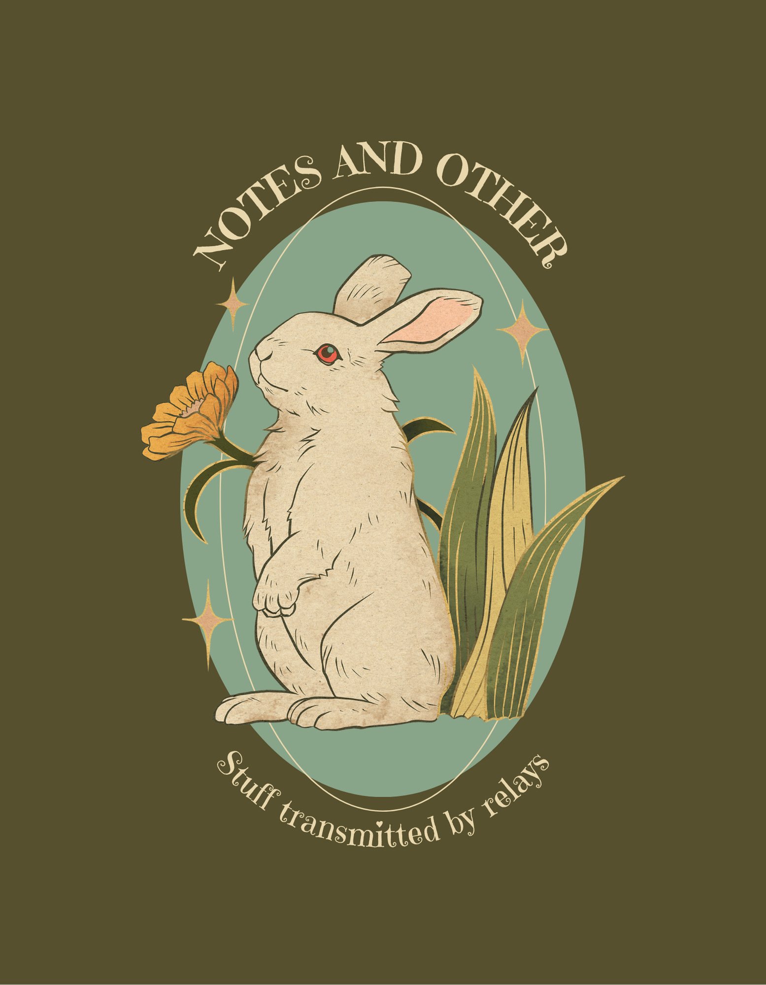
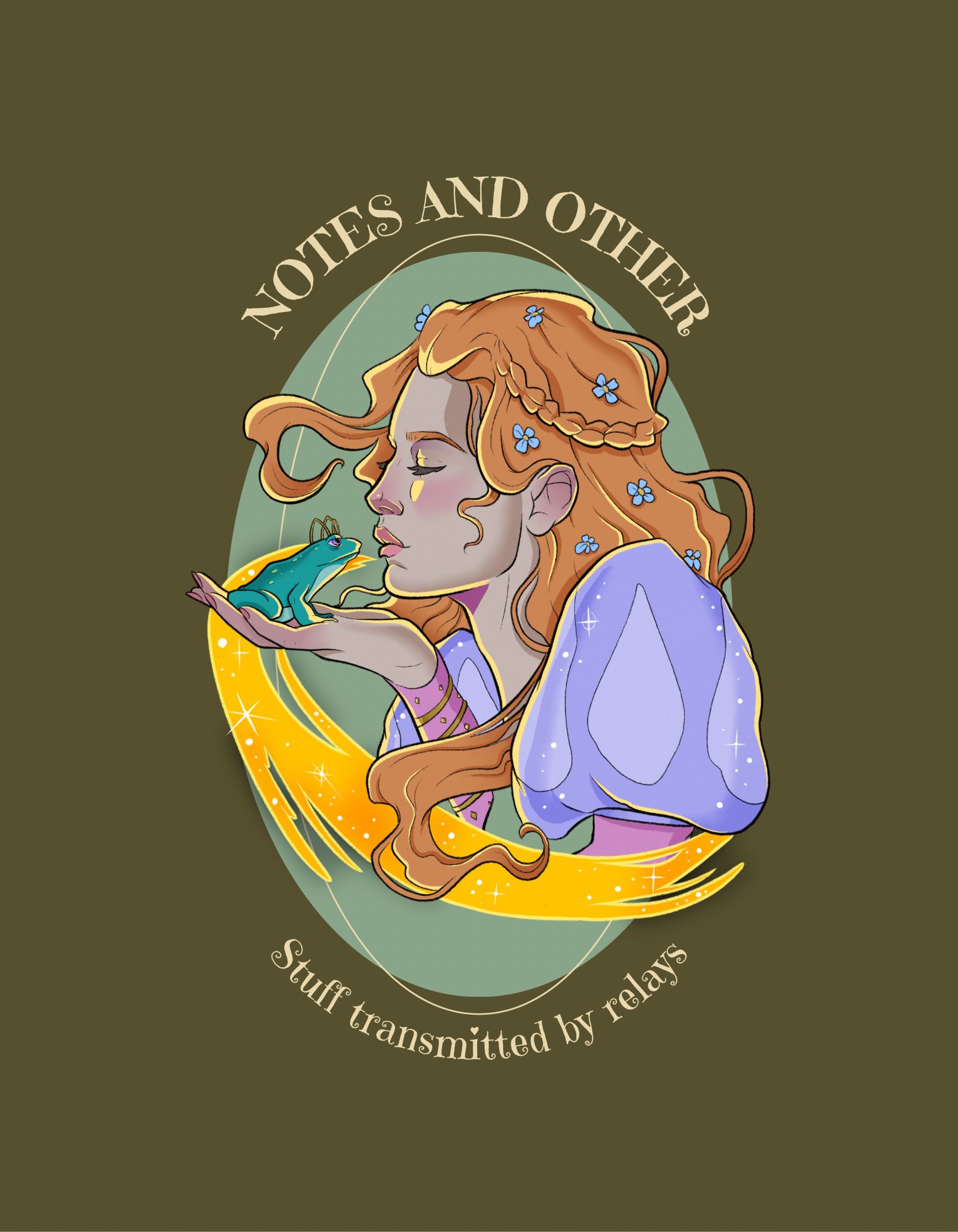
 which design do you like better for a shirt ? 1 or 2 ? will zap answers since they’ll help a ton https://i.nostr.build/roj4w.jpg https://i.nostr.build/Z5agE.jpg
Dos!
Door number 1
Number 1 👀
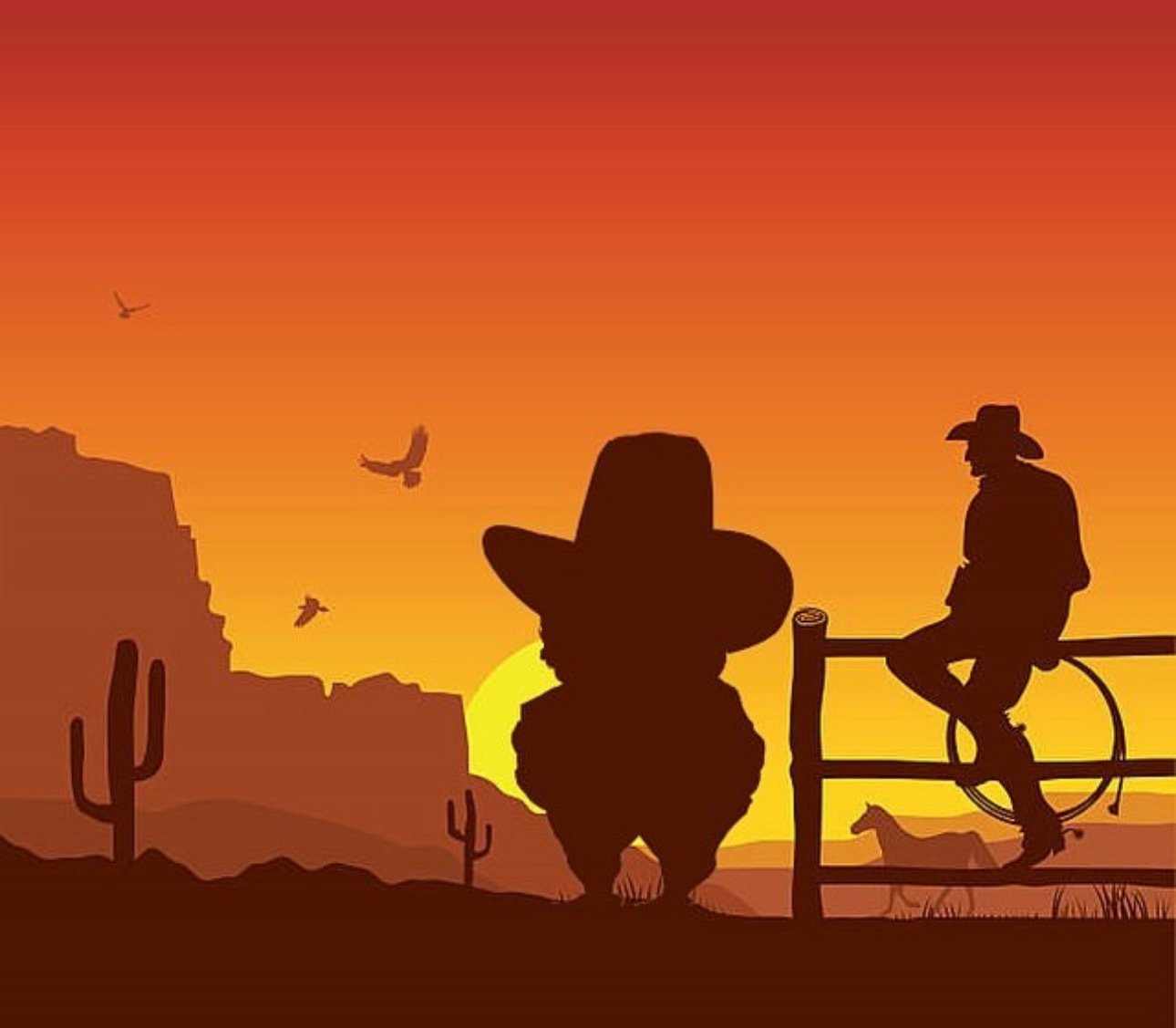
 now available 🔥

https://proofofink.com/product/nostr-cowboy/
Looking beautiful 🤩
1. Clean and simple. 2 can be nice but looks not yet finished and too much
I feeeel that!! I had also done two more variations of that one, but didn’t like them as much idk https://i.nostr.build/dw8lY.jpg https://i.nostr.build/O4AB0.jpg
Yeah I like when it clear. But maybe its the Font and oval background what I don’t like.
I feeel that! Thank you so much 🫂🙏
So I think with removing oval background and place the text just horizontal under it would make it more clean. Style is still nice so no need for this oval circle🤙
 Oh.. 1 is good.

Don't zap me.
1
 Now available 🔥🫡

https://proofofink.com/product/nostr-cowboy/
 Oof. Hard one to pick.
As a Nostr goofball, I'd choose the ostrich.
In general though, I'd pick the other one because the art deco style is pretty sweet.

TLDR
The ostrich to attract interest by laughs.
The fairy to attract interest by fanciness.
Shirt 1. Wud buy
 We released it 🔥

https://proofofink.com/product/nostr-cowboy/
 Don't zap me.

1
Western nostrich ftw
I’d say shirt 1 would have more appeal to men and shirt 2 to women.
This is spot on
I especially like the look on the Nostriches face… he means business!!
he’s based on @PABLOF7z & @gsovereignty
text layout in both is not great. Especially the inconsistent capitalization in the fairy one. all-caps or no caps
So neither right ?
Well i definitely prefer the ostrich
You need both. I can easily imagine a couple each wearing one of those designs.
 1
Especially for nostrville in November
left looks pretty cool
I’d but both, but I’d opt for second one before first
Buy**
The first one is great, but the text is too much I think, at least in that one area.
1. Any other designs?
Honestly both look good, but if I was going to wear one it be #1… I don’t think I could pull off the fairy t-shirt
the ostrich one, hands down.
First by far
#2 looks better
How many sats I want one!
 50k ⚡️

It’s now available 🔥

https://proofofink.com/product/nostr-cowboy/
  @sperry  zapped me Sats so I can buy a `𝕾𝖊𝖗 𝕾𝖑𝖊𝖊𝖕𝖞` Tshirt that I am IMPATIENTLY waiting for how do I buy it thanks love a pleeeeb

nostr:note1k53mt78jcjs4yd883wr6ne90pkwnv2ss0c59g0hhnj6qwmhysxdschzwlg