 @134318c2 MSNBC has terrible graphs.  This is apparently supposed to represent government employment changes during recessions, but in addition to everything else, the "during recessions" caveat is completely missing.  At least the labels on the y-axis are evenly spaced.

https://cdn.masto.host/sciencemastodoncom/media_attachments/files/111/068/689/231/193/846/original/07d65f622bbf668b.jpeg
 @bdabbff7  This is going in my collection. Do you remember the date when it was broadcast?

Broadcasting a graph as part of TV show or in other video formats often leads the presenters to greatly “simplify” the graph. It is unlikely to be studied closely— providing instead a general impression. Even if well-supported the viewer may not know why. Instead it conveys “this is quantified and science-y”

What are some best practices for presenting data in videos?
 Oddbean new post about login | logout
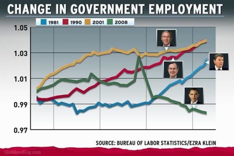